Measurements and Viewing
User Level Adjustments
The Black Bars test on Avia is very good test image for setting the
brightness, as it presents two almost black moving bars that are just above
or lighter than black. At the proper brightness setting, you should just be
able to see the darker of these moving bars and easily see the lighter one,
thus assuring that shadow details are properly distinguished from black. The
moving almost white bars in the Needle Pulse test can be used in a similar
way for setting the contrast.
Using a progressive component input from my Denon 1600 DVD player, I found
that proper settings for contrast and brightness were +3 and 0. Color, Tint,
and Sharpness seemed properly adjusted at the default setting of 0. Using
the
Bravo D1 DVD player with DVI, I found proper settings for contrast and
brightness were +10 and –17 with Sharpness needing to be set at –9 to get
the best image using the Avia Sharpness test.
Measurements
When I evaluate a projector, I not only look at images, I measure the
color balance of the projector at various light intensity levels and
determine the quality of what is called "grayscale tracking". The idea is
that black, white, and all shades of gray, should have the correct ratio of
the three primary colors used in video projection Red, Green and Blue. You
can read more about the testing method in my past projector reviews on
Secrets, or at http://www.smartavtweaks.com.
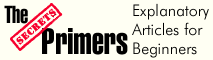
The Color Balance data from the 12000 with the CLR Temp control set to
6500K is shown above. Obviously, the measured color balance of the 12000 is
quite flat but with a little bit too red, much especially a the lowest IRE
levels. The above Color balance chart was obtained using the DVI input, but
equivalent color balance data were obtained using the component input.
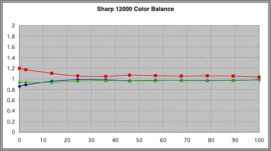
After adjusting the red offset to –3, the color tracking now became
remarkably flat all the way down to IRE 0. (Perhaps another iteration where
the red gain was increased a point or two to raise red slightly was called
for, but I quit while I was ahead.)
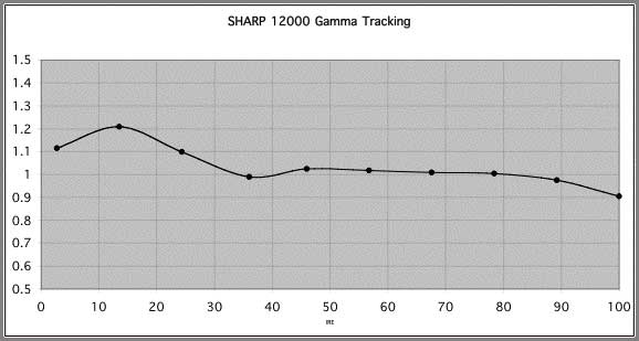
Gamma Tracking
The other thing we can measure is gamma tracking, or how the light output
of the projector responds to the input signal. If the projector's gamma
tracking is off, then details in the image will either be lost or the image
may look flat and have little contrast. The Gamma Tracking graph shows the
combined light intensity at the various IRE levels relative to a theoretical
level, calculated for a target gamma. If the projector is accurately
producing the intended light intensity level as a function of input or IRE
level all values should be close to 1 in the gamma tracking graph.
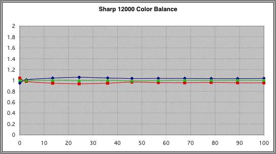
Gamma tracking with the 12000, using the Standard gamma was also
remarkably good as can be seen is shown in the above graph, calculated using
an overall gamma of 2.2.
The actual signal level in this IRE 10 window on Avia is actually closer
to IRE 2.7 (the actual value of the other IRE levels are also slightly off)
and hence the offset between the nominal and plotted IRE values. The gamma
tracking behavior will be further discussed below in the Comments section.
In contrast, gamma tracking in the Black Detail gamma mode shows a
distinctive bump in the light output at the low IRE levels – perhaps
revealing black details, but at levels above the correct levels – thus
potentially softening the picture by lowering the gamma (to 2.0) at the
lowest IRE levels.
Light Output and Contrast Ratios
Stating the light output and contrast ratio of the 12000 is not simple,
as there are two different lamp modes, Economy on and off, and three
different Iris settings thus giving six potential operating modes. Because
of fan noise issues, I did all of my viewing of the 12000 in the Economy mode. With Economy on, and with the High Brightness mode of the Iris,
the projector produced an IRE 100 window with a brightness of 15.3 ftL on my
102” diagonal unity gain (gain=1) DaMatte screen, representing 474 ANSI
lumens light output from the projector. With Economy off, I measured 20.1 ftL or 621 Lumens. The IRE 100/IRE 0 contrast ratio in the High Brightness
mode was 1348:1.
In the Medium mode of the Iris, (Economy on), the light level at the screen
fell to 7.1 ftL (218 Lumens), but the contrast ratio increased to 3085:1. In
the High Contrast Iris mode, the light output fell further to 6.3 ftL (195
lumens), but the contrast ratio rose to a remarkable 4394:1. All of these
measurements were made with approximately 100 hours on the bulb.
Scaler and Deinterlacer – the Video Essentials Montage
Although I now have the newer Digital Video Essentials, I still find the
familiar Montage on the original Video Essentials disk essential for
checking out a new projector, especially with respect to the performance of
the deinterlacer. For the 12000, however, I needed to compare three modes,
interlaced and progressive from my Denon 1600, and DVI from the Bravo D1 in
the 720p mode. All modes tested well, but I was surprised to see that there
were more jaggies in the waving American Flag, using the DVI input compared
to the other two modes. In general the DVI image looked very good, and
bleachers, bridges, buildings, and leaves were well handled by all modes of
operation, but, no question with DVI from the D1, the waving flag had more
jaggies than the other modes.
The 12000 seemed to do a very good a job deinterlacing NTSC signals, but I
have heard from a friend who owns a 12000, that the 12000 does not
deinterlace PAL signals as well as one might expect.
Viewing and Comments
I found the Sharp 12000 to be a delight in every way. It was easy to set
up, with plenty of inputs in just the right format for the equipment I needed
to connect, lens shift so that I could use my high shelf in the back of the
room, and a great picture right out of the box. The 12000 allows a great deal
of tweaking, but frankly, it didn't require that much to get very good
grayscale tracking all the way down to IRE 0.
The gamma tracking was also the best I have measured for a DLP projector. In
previous reviews, I have never shown the gamma tracking data for the point
measured with the IRE 10 window on Avia (which is actually about IRE 2.7),
as that point often appeared to be anomalous.
After measuring the 12000, and reviewing previous measurements, it now seems
that the IRE 2.7 point was not anomalous, but in fact corresponded very well
to what is actually going on with the projectors. With non-HD2+ DLP-based
projectors, and with the proper brightness setting, the mirrors could be
essentially off for IRE 0, (no obvious dithering), but when they needed to
make, say, IRE 2.7, the light output at these almost black levels was always
well above the theoretical level for the given gamma.
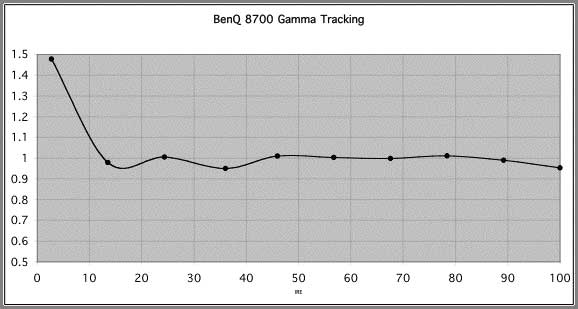
This gamma tracking behavior of a non-HD2+ projector can be seen using data
from the recently reviewed BenQ 8700, graph shown above. In this case, the data point at IRE 2.7
is considerably above the theoretical level. (Note, LCD-based projectors
typically track very well down to IRE 2.7 as they do not need dithering to
make the almost black levels).
Without the dark green segment, now included with HD2+-based units, making
almost black meant fairly visible dithering. If you walked up to the screen
to view a scene that contained black, and near black shadow details, the
shadow details often stuck out like little glittering islands, with an
average light intensity well above black. When trying to adjust the
brightness control, I typically found that either the bars were missing
(brightness too low), or with an increase of one brightness unit, they would
pop up brighter than expected, and with obvious dithering.
Not so with the HD2+ 12000 where the shadow details (and black bars)
appear to be much more natural and less distinct from the black background,
which is a good thing. Excellent low level gamma tracking, combined with a
reasonably good contrast ratio contribute significantly to the believability
of scenes containing dark objects and shadow details.
As 15.3 ftL is an ideal light level - even a bit brighter would not
hurt - and 6 or 7 ftL is clearly too low, I did most all my watching in the
High Brightness mode. Everytime I used the Iris control on the remote to
see if perhaps one of the other modes might be OK, I quickly came back to
the High Brightness mode if the scene was at all normally lighted.
I will confess however to using the Iris button on the remote to
occasionally lower the overall brightness of the projector for
extended dark scenes – kind of fun, but not really practical, especially
since distracting little messages appear on the screen telling the audience
what you are doing.
Obviously one would like the brightness of the High Brightness mode and
the black levels and contrast ratio of the High Contrast Mode all in a
single mode. So here's the catch with the 12000, you can't have it all at
the same time – you can't have full light output and anything close to the
specified 5500:1 contrast ratio. It's more like 1350:1 with full brightness.
Of course, that is still far better than the contrast of the first LCD home
theater projectors, and better than many modern projectors, including my
reference Sony 11HT.
If you do want to take advantage of the 12000's remarkably high contrast
ratio in the High Contrast mode, you will likely want to choose a screen
with considerable gain, especially if the Economy mode is also selected
for quiet operation. A screen like the DaLite High Power screen with a gain
of 2.8 is a popular choice with the 12000 for this very reason. (It should
be noted however that this High Power screen is retro-reflective, does not
show any “hot spots”, a common problem with high gain screens, but only has
its full gain available for table-mounted projectors.)
The colors on the 12000 were wonderful – no complaints about under-saturated
greens with the Sharp. Actually using the C.M.S. I could have about any
color I wanted! I started watching using the Film Tones mode for the C.M.S.,
but the colors were perhaps a bit too subtle or under-saturated.
I then explored the C.M.S. system and saw that by decreasing the Red Chroma,
it would increase the blue and green content of the red primary, and move
the position of red on the CIE graph closer to white. By increasing the
Red Chroma, the blue and green content decreased and moved the red primary
further from the white point, making it more “red”. The Red Lightness
increased the intensity of red without moving its position on the CIE chart,
i.e., the measured color ratios did not change. The Red Hue control could
be used to make red either more orange, by adding more green, or more
magenta, by adding more blue. The changes to Hue were easily apparent to
the eye, as well as the light meter. I also tried some C.M.S. settings
recommended by other users, but found that those settings neither measured,
nor looked good with this particular projector. In the end, I found that the
Standard mode for the CMS gave better saturation than the film mode,
especially for blue, and good secondary colors as well, and so in subsequent
viewing I used the Standard CMS mode.
Having used the 12000 for about a month gave me a chance to view many of my
favorite movies on DVD, including two editions of “Lord of the Rings”,
“Fifth Element”, “Galaxy Quest”, “Ideal Husband”, and our new favorite
“Pirates of the Caribbean”. They all looked the best I had ever seen them.
In watching DVDs, I used both my Denon 1600 with a progressive output and
the Bravo D1 with DVI. While the images with DVI were perhaps somewhat
cleaner, I never really felt cheated when I used the Denon and a progressive
component input to the 12000. Both looked very good.
Using my Dish 6000 satellite receiver, I was able to watch a number of
movies in High Definition, ranging from “Die Another Day” (a better movie
than I thought it might be), to the “Music Man”, as well as episodes from
several favorite series such as “Dead Like Me”, and “Odyssey 5”. While I
generally fed the 12000 a 720p signal, its native resolution, it also handled 1080i
signals with no obvious problems.
Overall I would describe the image from the Sharp 12000 as clean and crisp
with subtle, yet well-defined, distinctions between different colors and
textures in the various scenes. The costumes in the “Music Man” are an
excellent example of this.
Shadow details are great, without obvious dithering artifacts, even when
standing near the screen – a big improvement over previous models. Black
levels are good, but could have been better. The use of a high gain screen
would certainly help in this respect, in that it would allow the use of the
High Contrast mode, and its much improved >4000:1 contrast ratio.
About the only other thing that I might mention, is, believe it or not,
the Screen Door Effect (SDE). With the 12000, I can see the grid around pixels
in bright scenes from my preferred seat, 11 ft away from the screen. SDE
with the Sharp is much less of a problem than with my reference Sony 11HT,
an LCD projector, but at the 720p resolution of the Sharp 12000, and even
with the excellent pixel fill factor achieved with DLP, I can still
occasionally see the pixel structure from my seat. If nothing else, this is
a tribute to the quality of the lens in the 12000 – when standing near the
screen, you can see the pixel structure equally over the entire screen.
Believe me, SDE is not a serious problem with the 12000, but it does
indicate that there is a case to be made for projectors with even higher
resolutions than 720p, e.g. 1080p. In essence, though, the SDE visibility
with the Sharp 12000 is a result of high brightness, excellent contrast, and
a very sharp lens.
Conclusions
I absolutely loved the Sharp 12000 and enjoyed every minute I spent with
it. It was easy to set up, easy to tweak to achieve excellent grayscale
tracking, had a myriad or other controls for tweaking colors, and best of
all gave a nice clean crisp image without obvious artifacts.
The Sharp 12000 is meant for a high-end Home Theater and, as such, carries a
premium price tag.
The 12000 is capable of producing a fine image with contrast ratios
exceeding 4000:1. To get the most out of this projector however, you will
need to choose your screen carefully, as the High Contrast mode necessary
to achieve these highly desirable contrast ratios has significantly
diminished light output. A screen with a gain of 2.5 to 3 would be ideal for
use with this mode. On the other hand I used the Sharp with
my unity gain matte white screen in the high brightness mode and was very
pleased with what I saw.
- Steve Smallcombe -